Friday, 1 May 2015
Tuesday, 28 April 2015
Evaluation Q6;
Q6: What have you learnt about technologies from the process of constructing this product?
In the process amking my magazine i have learnt a lot about technology. firstly i have been able to expand my understaning of photoshop. going into this project i knew the very basics of photoshop but through photo manipulation and using more complex tools i have a much higher level of understaning of photoshop. coming into this project i also have no experience using DLSR camera which i used for my phootshoots. from this i have leant how to take high quality photos and now also have a better understanding of compsition and light due to using these cameras. for my magazine i also used a site called Dafont. this website allowed me to use a wide range of fonts for my pages and not be limited to the apple font collection. the use of dafont also contributed in my learning to edit texts in photoshop. when i started the project i also had as no experience with using blogging sites and for the project i had to learn how to uses Blogger. at first i found using the site quite difficult but as the project progressed i became much more comfortable with it.
Sunday, 26 April 2015
Evaluation Q5;
Q5: How did you attract/address your audience?
A way i have addressed the younger side of my audience is through the cost the magazine itself. i made the magazine fairly cheat as most student don't tend to have a steady income and by lowering the cost (£2.00) the magazine will make it more affordable for them.
Front cover;
In my front cover i addressed my audience throught the overall style of the front cover. i wanted to keep up with this edgy look for my cover to appeal to the younger side of my audience. i also used the contrast of the desaurated colour of the image and the boldness of the font colours to stand out and catch the eye of the viewer. i chose to have a very bright colour for part of the cover to appeal to the younger majority of my audience. i wanted the cover to stand out more for them as they will most likely be the dominant consumers of my magazine. i also made the models used in my magazine young to relate more to them. however i did consider the older majority of my audience as i made the layout and colour scheme very reminiscent of 1970s/80s style music magazines. the fonts, shapes and colours on my cover are very age neutral. when making the cover i looked at a range of different fonts and colours before i decided which ones would work the best corresponding to my target audience.
Contents Page;
For my contents page i distributed the features on the page so that they would appeal to all of my audience. i added a feature about 'The Velvet Underground' to appeal more to the older audience. i also added segments about musical theatre for the older audience. for the younger audience i added features about much newer bands (craft spells, Restless natives) to appeal more to them. for my contents page i also kept the same bright, bold colour scheme to appeal to my audience. i also made the layout of my contents page quite busy as from looking at magazine like 'Keerang' which also appeal to the same audience as mine also have quite busy contents pages. the distorted image on the page can also appeal to the majority of my audience as it is common in most indie rock magazine (appealing to younger audience) and also influenced by the technicolor, hazy look of image used in magazines in the 70s (appealing to older percentage).
Double page Spread:
On my double page spread i have again continued with my colour scheme (appeals to my audience). for my DPS article i cater more to the younger majority of my Audience by interviewing a younger band appealing more so to them. for the article itself i slightly backed away from making the article read to long as most young people don't prefer to read for too long. i also chose to layout the article quite precise and neat as they seem to prefer a nice, neat straight forward page to read. were they can simply read the page and flick the page. at the bottom of the page i added links to social media sites which adheres more toward the younger generation who gene really use social media a lot more. the inspiration for my double page spread did however come from looking at different DPS's from vintage magazines. from these magazine i used a similar layout. the half black, half white pages, the washed out coloration of the pages and images. i did this to relate to the older readers.
Wednesday, 22 April 2015
Evaluation Q4;
Q4: Who would be the audience for your product?
I chose my target audience based on the sub genres i have covered in my magazine. as my magazine is open to a very wide range of different lifestyles i figured that this would mean within those different categories there would people of very different ages therefore which drove me to make my target audience range between the age of 18-30 and make the magazine gender neutral. i also had to think about a more realistic age range for the magazine, which means thinking about who acutely reads music magazines and who would be interested in my theme, which lead me to come to the conclusion that this would be the perfect age group for my magazine.
the colour scheme and style of my magazine allows the magazines overall aesthetics appeals to the majority of my target audience. even though the colour scheme is mostly pink (commonly associated with females) i have used it in such a way throughout my magazine pages to allow it to appeal to both male and female readers as the colours revolve more so around the theme and style than the actual individual.
Due to the higher percentage of young people who read magazines over the older generation of readers. The majority of people who purchase/read my magazine would be within the 18-22 region of my target audience. i took this into consideration when making my front cover so i made the model on the cover be within the same age range to appeal to them more.
Friday, 17 April 2015
Evaluation Q3;
Q3: What kind of media institution might distribute your media product and why?
My magazine will be sold in small shops and supermarkets. this will make the magazine more available to a wide range of buyers and make buying the product easy giving them a wide variety of places to purchase it. my magazine will also have a online feature (website) to keep readers up to date with the magazine. my magazine will also be distributed ate concerts and festivals (common locations of my target audience) and small newspaper and magazine stalls around the country. My magazine will be promote via internet applications such as Facebook, twitter etc. the magazine will be have wide spread promotion to appeal to my wide spread audience (different lifestyles). the magazine will be fairly frequently distributed over a space of a week so my audience needs to be kept up to date with the magazine which is why wide spread promotion is important for my magazine.
Evaluation Q2;
Q2: How does your media product represent particular social groups?
before i began making my magazine i set out to make my magazine appeal to a large audience. form different ages. (around 18-30 yr olds), different lifestlyes, cultures. i think my magazine represents the social groups as first of all the theme of my magazine is rock which appeals to a wide range of different people. rock has been a popular genre of music over the years as it his so many different variation and choices (indie rock, heavy metal, classic rock etc.) unlike other music genres that are fairly linear. which is why i decided to not pin point a specific genre of rock for my magazine to cater to different people. this is evident in my magazine as there is a bold contrast in my models. the first being toward the indie side and the second toward the more metal side.
Through research i have noticed that vintage sheek has become very popular over a very wide spread variety of people, from trendy hipster groups to the gothic style. each of these different groups seem to add elements of 1960s/70s fashion into there style. which is why i wanted to take this approach with my magazine style and decided to incorporate elements of 60s/70s pop culture in to my magazine. another reason i did this was to allow my magazine to appeal to a much older generation, and add a element of nostalgia into the it. the colour scheme of my magazine is very reminiscent of 70s and 80s pop culture. bright florescent colour are very similar to the colours used by the likes acts from the same era like David Bowie, The Beatles etc.
the contents of my magazine are also quite neutral. containing interviews, information etc. quite generic features that would be found in most magazines. i have however made the contents of my magazine appeal to the poeple within my target audiences age range, meaning parts of the magazine don't appear to be too mature or too childish as the age range varies from 18-30.
Wednesday, 15 April 2015
Evaluation Q1;
Evaluation;
Q1: In what way does your media product use, develop or challenge forms and conventions of real media products?
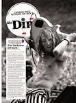
For my magazine i looked at creating a rock magazine. For the magazines style i looked at a more old school rock theme, so taking inspiration from magazines from the 70s/80s era.
 |
| my mag cover |
.jpg) |
| inspiration from thrasher magazine |
 When looking at other rock magazines i also noticed that the majority of them have there main cover image overlaping the masthead. this is done to put the the main focus on the models in order to give the reader an insite into what the magazine contents are. i also decided to do this with my own magazine cover.
 |
| 3D effect on contents page |
 |
| 3D effect from clash mag |
In my double page spread i mostly kept with the typical conventions of magazine DPS's. with images related to the article, consistent colour scheme, slightly generic layout. bold fonts (titles, Logos). For in my DPS i stuck with a slightly more indie rock theme with the colour scheme of the page in order to appeal to my target audience. i also kept a similar colour scheme with the rest of my magazine pages. i wanted to also keep the 70s, 80s rock them consistent throughout my magazine, so i added a slight discoloration in the page to give it a more vintage look.
Thursday, 9 April 2015

Saturday, 28 March 2015
Process of Making Double Page Spread
Process of Making; Double page Spread
Media article- restless natives
Restless Natives are and new upcoming band that have
recently excelled in fame. There new album ‘Yes No Maybe’ was a hit in its
first two weeks of release and their gigs are sold within days. The band are
known for their slow but harsh approach to rock music, their work is very
reminiscing of the likes of classical rock artists such as The Ramones and Pink
Floyd. The band is rapidly bringing the sounds of the 70s back to the present.
The band could the start of a new era in music which is an exciting step for
the band to take so early in their music career.
Interview with lead vocalist of Restless Natives- Rebecca
Cain
So how does it feel to have your album be a hit?
Oh gosh. I am literally speechless. I can’t believe our
luck. As an artist when making and album there’s always this thought in the
very back of your mind that no one’s going to like it or that no one’s going to
even buy it. [laughs]. I know it’s a slightly weird thought to have but the
others and I see these experiences as a way better ourselves in what we’re
doing. And in this case I guess it worked [laughs]
What about the fame side of things how does it feel knowing
there are people out there that love the work you’re doing?
[smiles] I can’t begin to tell how thankful we all are
toward these people who attend our gigs, buy our album. You have just help make
a group of people’s dreams become a reality. I feel like bursting into tears
when I see a crowd of people singing along and dancing to our music. I feel like
if I did people would think im kinda lame [chuckles]. But it is amazing.
And when you write songs and make music. Well what to you do
to produce a solid final product?
Well most of the inspiration for writing the song itself
would come from the experiences of whoever would be writing in the band. This
can be a joint effort from the rest of us or just the individual. But the music
side involves the whole band. We do sometimes sit there for hours sometimes we
spend days in the studio just playing chords and notes until we have a eureka!
Moment which is usually when we have found the instrumental for a song. Not an
easy process and sometimes a tiring one but it is worth it in the end but we do
love what we do so it is an enjoyable process.
Im intrigued to know where your inspiration comes from, in
terms of your sound. Because you have a very distinctive and unique sound to
your music. If I say so myself one I haven’t heard in years.
[laughs] yeah,
well we take inspiration from the older generation of rock. The likes of Led zeppelin, Pink Floyd, sonic youth, to name a few
[chuckles]. The first album we
first listened to together was ‘Dark side of the Moon’ by Pink Floyd and from
then on we were hooked at the time we were about thirteen and we thought it was
amazing. My dad is an intense record collector and kept his old records and
Vinyl player in our attic. He worked on Saturdays so once he left we’d take them play then full volume and put
them back as they were before he left. Oh god he’ll go mad when he sees this
[laughs] sorry dad.
So you are yet to play at the House of Blues. Lots of
legendary artists have played there. How does it feel to be amongst them?
Oh wow. I don’t think we can begin to compare ourselves to
the people who have played there before us [laughs]. It is a great honour for
use to play there it’s been our dream to play there since we were young and for
it to actual become a reality, it is frickin awesome. And how does it feel?
Well im hella exited but if you want honesty, im also quiet nervous [laughs] I
mean I don’t want to mess it up.
And what is next for Restless Natives?
Well hopefully a career {laughs]. No, we would like to bring
out some new albums. We are currently working on one now so hopefully in a
couple of years we can release it. We begin our tour as of June next year.
Tickets are on sale in October and well we hope carry on making people happy.
It was an absolute pleasure talking to you Rebecca and good
luck with your tour and upcoming projects.
Restless Natives: Tour- Tickets on sale from October 10th
Purchase tickets at: www.RestlessNatives/tickets.com
@RestlessNatives twitter
for my double page spread i set out to create a take inspiration from the old school 70s rock magazine double pages as i feel that the style fits in really well with my overall the as well as my other pages

i decided to do a split page for my double page i feel this works well with the rock them as i adds a dark, slightly sinister, grungy look the the page.

for my image i decided to place it in the top left corner so that it is the first thing you see upon opening the page.
i decided to make the image itself look worn. i did this to stick with the 70's rock them. i think the colour also adds an element of edginess to the image (linking to my theme [rock]).

 to do this effect i used the transfer to 'old fashion photo' to get the worn vintage effect.
for the the written sections of my double page i decided to stick with the same colour scheme i have used throughout my magazine. i did this so that it is relevant to the rest of my magazine and so that it works with the rest of my pages.
i also decided to play around with the lay out of my article as it is influenced by the previous rock magazine covers i have looked (old magazines).


Wednesday, 18 March 2015
photoshoot 2
Double Page Spread Photo shoot;
For this photo shoot i wanted to take a more grungy approach to my images. when preparing for the photo shoot i had to think what would work best for my theme and consider that my magazine is a rock magazine. i also chose my location very carefully for this shoot. i went to a churchyard to take these photos. the location was worn, dark and looked abandoned. this catered to the more punky, metally rock aspect of my theme.
For my photo shoot i had prepared my model to dress in much darker clothing with darker make up to correspond with the background.
Graphic T-shirt; The t-shirt corresponds to the theme as it has a rock bands graphics on it.

Dark make-up; The darkness of the make-up correlates with my theme as it adds a element of grunge to the images. i also like how the make up looks in the image because it is very reminiscent of make-up from 1970s/80s rock magazines which is good because that is approach i wanted to take with my magazine as i have already taken a lot of
inspiration from 70's and 80's rock magazines and incorporated some of
there ideas of colour schemes, composition and fonts into my own work.


For this photo shoot i wanted to take a more grungy approach to my images. when preparing for the photo shoot i had to think what would work best for my theme and consider that my magazine is a rock magazine. i also chose my location very carefully for this shoot. i went to a churchyard to take these photos. the location was worn, dark and looked abandoned. this catered to the more punky, metally rock aspect of my theme.
For my photo shoot i had prepared my model to dress in much darker clothing with darker make up to correspond with the background.
 |
| Models T-shirt |
Graphic T-shirt; The t-shirt corresponds to the theme as it has a rock bands graphics on it.
Dark make-up; The darkness of the make-up correlates with my theme as it adds a element of grunge to the images. i also like how the make up looks in the image because it is very reminiscent of make-up from 1970s/80s rock magazines which is good because that is approach i wanted to take with my magazine as i have already taken a lot of
inspiration from 70's and 80's rock magazines and incorporated some of
there ideas of colour schemes, composition and fonts into my own work.
Tuesday, 10 March 2015
Double page Spread research
Double Page Spread Research

I decided to look at much more old fashioned example of exiting double page spreads because for my magazine i am looking at rock as a overall theme, so that includes indie rock, metal rock etc. however in a visual aspect i wanted to focus on a more old school rock theme. (70s,80s).


what i notice when looking at these
pages is that they layout the sections of the page quite spaciously. they also keep the background of the pages very busy, with images and bold writing giving it a quite chaotic look (adds to them rock)
the lay out of the interview is fairly similar. they all pretty much have the text strip going down the page which is simple but it looks really effective with the rest of the page which is generally quite busy. they all also use quite mundane colours. there not too vibrant. however i think colour would work quite well with the theme.


i then started to look at existing pages that use hints of colour. i think the colour works as it makes the page stand out a lot more and makes it a lot more eye catching.
Friday, 27 February 2015


Friday, 20 February 2015

Sunday, 15 February 2015
Process of making my contents page
Process of Making My contents page;
 |
| contents page background |
I created the background by creating various brushes of paint splashes and collaged them together on the background layer.
 |
| contents background title and shapes |
For the writing ('contents') i made the font into a brush as this allowed me to print it wherever i wanted to on the page. it also allowed me to play around with the opacity to make the font look like its been painted on. i wanted to maintain this painted theme throughout my contents page with the paint splatters and the
 |
| contents image arrangement |
i then went on to add images onto my contents page. the idea i had for my contents page was to cut up the images into sections to create a distorted face. i want to do this as i felt it would fit well with my theme. in the images i wanted to take carry on with the distorted look so i decided to give each image a fuzzy, 3D effect. i did this by layering two different colours on top of each other. i didn't go with the traditional red and blue 3D effect instead i chose to layer the colours i used through out my magazine (pink, green, black and white). in the image in the centre i layered pink over the original black and white image. and in the image the right i layer the green colour over pink.
 |
| contents page font |
For the font for my contents page i wanted to choose a font that would fit well with my theme. i decided to choose this one as looks disarrayed which fits in with the distorted look i have carried through my magazine.

page i wanted to make the
words look like they have been
painted on to the page. to
create this effect i made the
word into a brush and printed
it onto the page. i lowered the
opacity so it wouldn't look to
bold.
These are the colours i chose
to use in my contents page.
(pink and neon green)i found
that these colours work well
with each other as they
compliment each other really
well...


Subscribe to:
Comments (Atom)