Double Page Spread Research

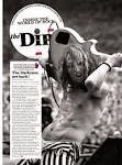
I decided to look at much more old fashioned example of exiting double page spreads because for my magazine i am looking at rock as a overall theme, so that includes indie rock, metal rock etc. however in a visual aspect i wanted to focus on a more old school rock theme. (70s,80s).


what i notice when looking at these
pages is that they layout the sections of the page quite spaciously. they also keep the background of the pages very busy, with images and bold writing giving it a quite chaotic look (adds to them rock)
the lay out of the interview is fairly similar. they all pretty much have the text strip going down the page which is simple but it looks really effective with the rest of the page which is generally quite busy. they all also use quite mundane colours. there not too vibrant. however i think colour would work quite well with the theme.


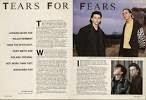

i then started to look at existing pages that use hints of colour. i think the colour works as it makes the page stand out a lot more and makes it a lot more eye catching.
No comments:
Post a Comment