Wednesday 24 December 2014

photo shoot 1


Front Cover Photo shoot:

In this photo i want to take a more subtle approach to the rock theme. as these photos will be used for front page. for this shoot i took the images in front of warehouse doors. this adds to the more grungy side of the rock theme. for the shots where the models hair is swept to the side i deliberately waited for the wind to blow in that direction i felt the this effect would add a edgy look to the images.


Sunday 30 November 2014

mast head ideas


Masthead Ideas 


possible developments

for my masthead i wanted to look a mixture of fonts which linked well into the theme of my overall theme.

I started to look at a mixture of very subtle font ideas (bottom three) and then other looked at the more hardcore element of rock music

for the colour i looked exclusivly at colours like pink, green, purple, red and blue. i looked at these colours because these are generally associated with rock magazines from the 1970s. i also took this into consideration when looking at the font. i looked at fonts that would work well spread out on the front of a old rock magazine.


i ended up choosing to focus on this font. i chose this font as i think it fit very well with the rock theme. i doesn't cater specifically to a certain type of rock. it is quite neutral. it also links in well with the old school rock theme. in terms of colour i am drawn more towards the pink as it work a lot better for the theme.


Saturday 22 November 2014

tap


Music Magazine Analysis


Music Magazine Analysis


For the people who associate themselves with rock music these magazines take their preferences into considerations through the fonts, colours, images and layout of the magazine. all the magazines use uses dark images for their front cover. from the way the models are dress to the filters they uses the images are presented to looks dark and slightly Gothic. most people who read these magazines and listen to rock music have very particular style, usually choosing to stick to dark, monotone colours. 

most of the fonts used on the magazines are quite messy and rigid which links to the music itself. the layout is also quite clustered which appeals to the life style of people who listen to rock music as they tend to where quite rugged clothes and live quite hectic lives. 

Magazine Comparison


Magazines like 'Rock' magazine target a very specific audience and it is important to use the right colours. images etc to appeal to the reader. magazines such as these wouldn't uses such features that ere used in pop magazines like the one on the left as it appeals to two very different people.


Wednesday 5 November 2014

Sub-Genre; Rock


My Sub-Genre; Rock

I have chosen to focus my sub-genre on Rock as this is a category of music that the majority of the time i listen to. when i read music magazine i am usually drawn to reading the magazine which associate with rock music. rock is usually associated with grunge and darkness which is shown in these types of magazines and which is part of the reason i by these magazines. to create my own rock magazine i will find photography and designing an interesting experience. rock it such an open category as it can venture from soft rock like ' The Velvet Underground' or or 'coldplay' to a band like 'black Sabbath' who are much harder.

Rock Artists; 

Black Sabbath, The Velvet underground,  Band of Horses, Nirvana


Rock Magazine Covers; 


One thing all of these magazines have in common are the uses of relatively monotone colours. the use of blacks, greys and reds add a solid, hard effect to the magazine. as most rock music aren't commonly associated with happy go lucky themes, the colour scheme of the magazines help maintain that perception of rock. 

Both 'NME' and 'Q' magazine distribute colour across the magazine to create an effective composition for the magazine.They both interestingly manipulate the contrasts between the plainer colours (grey) against the brighter, bolder colours (red) to make the magazine cover stand out. noticing that the brighter colours are used less and only for the larger, bolder areas implies the colours are used as a guide for the observer to draw them towards the significant areas of the cover.  

'kerrang'however take a very different approach to their colour scheme. the magazine uses a combination of black and white on the front cover. the background of the magazine is solid black which helps bring out the cover image but also helps to make the font bolder and easy to read. the significance of using black links to the contents of the magazine. 'Kerarang'covers the mush harder side of rock so by using black gives the cover a darker, slightly sinister look connecting the the music the promoted such as the band on the front 'Metallica'. 

The fonts for all of these magazines are very different and portray different areas of rock. the font itself for 'NME' is quite simple it hasn't got any graphical enhancements however the red makes it stand out and the white trim around the side almost makes it look 3D making it seemingly jump out of the page. on the other hand 'Kerrang'has effectively designed there font to fit the genre of the magazine. the lines through the text remind me of slashes. this gives the magazine a more hardcore, slightly controversial aesthetic
it also links to the sounds of rock music which corresponds to the name 'kerrang'which itself is an onomatopoeia of an electric guitar. in contrast to this 'Q' magazines font is more formal looking. the text at slightly italic which makes it look more formal and articulated. red and white are a quite calming combination of colours. this adheres to the softer side of rock.

'NME' and 'Q' magazine have close up images, combined with the gray filter they both use makes the image look slightly cinematic which ultimately gives it a more dramatic look. this give a specific status to the band (oasis) on the cover. making them look enigmatic and careless. 'Kerrang'however have a more natural image and mainly focuses on the facial expressions which are crumpled. all magazine images look towards the camera which creates a connect between them and the reader. due to their facial expression they all look provocative which link to the music (rock) as it is the most provoking genres in music 

The Layout of theses magazines are very similar as they all have the majority of the text behind the image. this makes the image stand out more again giving it a more provoking look. this also make the image look slightly three dimensional. they all also have the most important areas of the magazine cover spread boldly across the front of the cover to emphasize on their significance        
         

My School Magazine; Contents Page


My School Magazine Contents Page :


This is my attempt at making a content page for my school magazine.

These screenshot show the process of making the page...


 1. I started of figuring how i wanted to layout the page. so i began to add different shapes and colours to set out the basis of my page. the shapes and colours all correspond to my front page like a theme in the design of my magazine. the shapes also fit with the overall theme of my magazine. (school advice).


2. I then went on to add a darker colour for the background and add more shapes. at this point i have set up a layout for were my texts are going to go. i decided to uses a darker blue(also a school colour) to make the text areas stand out more and make them more easily readable. 


3. I started to add writing into the boxes. like i intended the boxes do help to make the text stand out. again i used the same green to standout over the dark blue. the title of this page is has the same layout as the front cover title this give both pages a similarity rather than them being completely different which wouldn't work so well.


4. This is my final outcome. finally i added some more texts to cover the page. overall i think for a first attempt it isn't that bad but i think i could be improve in terms of imagery as it looks bland and simple which contents pages should as they are the pages that set out for the rest of the magazine 

Sound


 Sound Lesson:


In lesson we were given a series of clips from films and TV show with no sound and just by using our voice, surrounding and audio tracks on the computer. we had to create our on interpretations of what was happening in that scene.


[CLIP STARTS AT 2:13]

in this recreation of the famous scene from the shining, music is used to set the scene. unlike the original scene a much more happier track is used which in contrast to the original high pitch, off putting screeching sounds that is used it puts the scene in a more bubbly cheerful mood. there is a good uses of foloy tracks. like the knocking and the dialogue that stays very true to the original clip the squeals of a woman in a state of fear seems to realistic and restores the clip back to its eiry original self and disregards the music cheerfulness.


'HERES JOHNNY!' Scene from 'The Shining'


 My School Magazine :


This is my final out come of my attempt at a school magazine. i chose to focus my magazine themes around sixth form and sixth form students (16-18). i hose to call it 'HAGG MAG' ('HAGG' references to to Haggerston) to take a more layed back approach to my magazine as it centers around teenagers. the image i used is also quite layed back as it give the reader a more calming feeling as the magazine is about school which is probably stressful to them. i used a lot of bright colours to keep it looking fun and readable. i made the font relatively large to make it read able but also give the magazine a feeling of positivity.       


Heading Font Ideas :


When creating my fonts i wanted to make sure that i was taking the expectations of my audience into consideration in terms of what colours i used, fonts, shapes etc. and what would fit my magazine as a whole.


for this heading i played around with the positioning of the letters to make the font look more original as well as give the heading a more edgier look to appeal to my audience (teenagers/sixth former. i manipulated the school colours to fit the appeal of teenagers. the font itself is bold and stands out which works for a heading. 
this is my preferred design.   


for this design i took a more sutler approach approach. the heading isn't amazing in terms of looks but it still stands out and it bold which is most important for designing headings. the contrast on the light and dark colours help it stand out against anything else but what lets it down is the fonts which are too boring and make the composition of the lettering look sloppy. 


     For this heading design i wanted to make it correspond to 
     the school theme so i positioned the letters to look like 
     a word search. i used the school colours again to make the 
     heading stand out. the contrast lightness of the green
     makes the black really stand out. i used a quite bold font
     for this design to make the letters look bolder. as a whole 
     i think the composition works but the only problem i have 
     is whether it will stand out on the front page of my 
     magazine?.....not so much.    


School Magazine Research :


A common theme i noticed when looking at other school maga-
zines is that the all adverts articles related to way to help students 
be prepare for their future whether being exams or figuring out 
what they what to proceed on doing in their future lives. as these
things can appear stressful for students at this point. magazines 
like these uses bright or bold colours which to theses students would
appear to be calming and ease their minds.


A key thing to take into consideration when creating my own magazine cover is to make sure 
that all of the content of my magazine whether being the theme, colours, images etc. appeals to
my target audience otherwise the key purpose of the magazine will diminish. 


Tuesday 4 November 2014


 Using Photoshop


Photoshopping Real Women Into Cover Models


A video showing the reactions of four women who participated in a Photoshop experiment


My Photoshop attempt

 Mila Kunis Before


                       and


The goal for this experiment was by using the filter, distort and liquefying tools to try to enhance the image and make it look better, how it is done on magazines photographs. i don't believe my attempt was very successful as the image looks worst rather than better. but the experience of using Photoshop was worth it. 


Tuesday 16 September 2014

Magazine Analysis


Magazine Analysis

Glamour Magazine
it being a film magazine the image itself it very sharp and most images they use tend 
to have a blue and grey tint to make it look like a scene from a box office movie


Glamour is a women's magazine published by Condé Nast Publications. Founded in 1939 in the United States, it was originally called Glamour of HollywoodIt targets women 18–49..

as it is a women's magazine much brighter colours are used apposed to a more masculine magazine which would often use much darker, stronger clolours. colours like orange and yellow are used as they are softer on the eye and such colours are associated with femininity and innocence which is also a reflection of the contents inside.The fonts used are quite blocky which relates to the vintage theme it seem to create. it almost looks like the opening titles to a 50s romantic movie which is again something appealing to its target audience. the image also has a white slightly orange filter to it which makes the image look clear and to some extent suburban look


Empire Magazine 


Empire is a British film magazine published monthly by Bauer Consumer Media. From the first issue in July 1989 .As well as film news, previews and reviews, Empire has some other regular features. Each issue features a Classic Scene, a transcript from a notable film scene.The regular Top 10 feature lists Empire's choice of the top ten examples of something film-related. A regular feature since issue 167, the masterpiece feature is a two-page essay on a film selected by Empire in the 'At Home' section. The selection of the films seem to be quite random and follow no specific pattern. 

The colours used in the magazine are bright and help the mazagine stand out. certain words are 
emphasized to make them stand out on the page.the contrast of the colours red and white over the fairly dark background allow for the magazine to have a sharp, clean look. due to 

.

Music 

                      Washed out- Paracosm


TV


The Walking Dead Season 5


The Walking Dead  Season 5 Trailer 


Film

Sin City: A Dame to Kill for 

                       
                                                      Sin City: A Dame To Kill For 
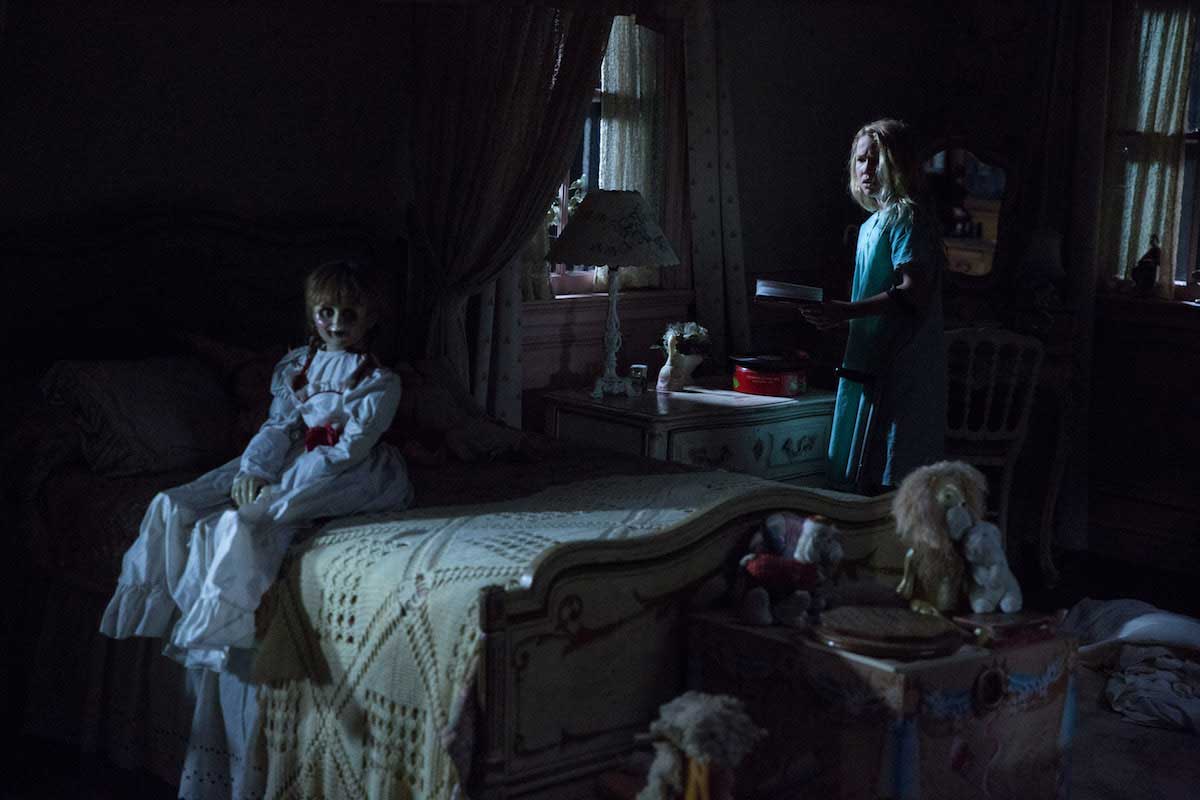


                                                               Annabelle


                     Annabelle- Trailer


Gaming 


                  Until Dawn 


            Dead Island 2
              
             Song: Pigeon John- The bomb 


             The Evil Within


Books/Comics/Magazines 


Fatale- Ed Brubaker, Sean Phillips


Torso- Brian Michael Bendis, Marc Andreyko