Tuesday, 10 March 2015

Double page Spread research


Double Page Spread Research


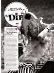
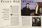
 I decided to look at much more old fashioned example of exiting                   double page spreads because for my magazine i am looking at rock as a overall theme, so that includes indie rock, metal rock etc. however in a visual aspect i wanted to focus on a more old school rock theme. (70s,80s).
   
                          
what i notice when looking at these
pages is that they layout the sections of the page quite spaciously. they also keep the background of the pages very busy, with images and bold writing giving it a quite chaotic look (adds to them rock)
the lay out of the interview is fairly similar. they all pretty much have the text strip going down the page which is simple but it looks really effective with the rest of the page which is generally quite busy. they all also use quite mundane colours. there not too vibrant. however i think colour would work quite well with the theme.    


i then started to look at existing pages that use hints of colour. i think the colour works as it makes the page stand out a lot more and makes it a lot more eye catching.

Friday, 20 February 2015

Sunday, 15 February 2015

Process of making my contents page


 Process of Making My contents page;


contents page background 
for the back ground of my contents page i wanted to stay with the same colour scheme that i used for my front cover. (pink, black and white). i decided to make it a paint splashed background as it add to the theme of my magazine, rock, as it is associated with being riotous, disorderly. 

I created the background by creating various  brushes of paint splashes and collaged them together on the background layer. 


contents background title and shapes
                                                                  once i finished with the paint splatters i then began to add shapes. I still maintained the same colour scheme (pink and black). i think the shapes add a irregular, slightly rugged element to the background. i decided to turn down the opacity level to the shape to tone down the colours a bit so that they aren't completely in your face.

For the writing ('contents') i made the font into a brush as this allowed me to print it wherever i wanted to on the page. it also allowed me to play around with the opacity to make the font look like its been painted on. i wanted to maintain this painted theme throughout my contents page with the paint splatters and the  


contents image arrangement 
                                                    
i then went on to add images onto my contents  page. the idea i had for my contents page was to cut up the images into sections to create a distorted face. i want to do this as i felt it would fit well with my theme. in the images i wanted to take carry on with the distorted look so i decided to give each image a fuzzy, 3D effect. i did this by layering two different colours on top of each other. i didn't go with the traditional red and blue 3D effect instead i chose to layer the colours i used through out my magazine (pink, green, black and white). in the image in the centre i layered pink over the original black and white image. and in the image the right i layer the green colour over pink. 


contents page font 

 For the font for my contents page i wanted to choose a font that would fit well with my theme. i decided to choose this one as looks disarrayed which fits in with the distorted look i have carried through my magazine. 


                                             For the title of my contents       
                                             page i wanted to make the          
                                             words look like they have been    
                                             painted on to the page. to     
                                             create this effect i made the 
                                             word into a brush and printed     
                                             it onto the page. i lowered the 
                                             opacity so it wouldn't look to    
                                             bold.                                   
                                                                                          These are the colours i chose  
                                                                                          to use in my contents page. 
                                                                                          (pink and neon green)i found 
                                                                                          that these colours work well      
                                                                                          with each other as they         
                                                                                          compliment each other really 
                                                                                          well...  


Thursday, 5 February 2015

research for contents page


Research for my contents page;


My theme is rock so i started to look at existing rock magazine contents pages. i decided to focus on these one specifically. what drew me to these pages were there layouts and colour scheme. i liked how some of them are so simple but the layout and colours make them stand out. i also like how some of them are quite busy which also makes the look really bold and stand out. 

although some of them are quite different in terms of layout they all do shares similarities. 

all of them do have quite big writing (big enough to read). the text used is also quite blocky and easy to read. the colours used on the text is spread out to highlight key areas of the page. 

the images used on them relate really well to the them (rock). they all are generally quite busy or quite desecrated to make them look quite grundy to add to the theme. the images are also place in a way to lure the reader in to read the magazine.

in all of the pages the text used underneath the featured areas is very brief. this is so that the reader will want to read more.

Generally the colours used on these pages are quite bright to make certain areas stand out. the colours also somewhat contrast each other so that certain parts stand out over others. 

the layout in all of the pages are quite spread out and spacious. this allows it to be seen better it also make the page look a lot neater       


Tuesday, 20 January 2015

Front cover


Final Outcome;


Process of Making Front Cover 


 i decided to change the colour of the image to add to my theme. i found that black and white worked for better with my theme. 

i used played around with the levels of the lighting in the image to add a slightly more darker much more grungy effect to the image.


 i made two layers so that the text could be put behind the image of the model. the second layer allowed me to edit both the image of the model and the background individually to give the cover a slightly 3D effect as the two section have different levels of light cast onto them.                                                                     

                                                                                 
i made the 'upcoming artist part a different font                                                                                       to make it stand out more as it is an important                                                                                        part of the front cover.

My final mast head choice

i chose a slightly retro, 70s type font to link in with my theme
for the texts i decided to put a black highlight around them. i did this so that the writing would be read easily.

Wednesday, 24 December 2014

photo shoot 1


Front Cover Photo shoot:

In this photo i want to take a more subtle approach to the rock theme. as these photos will be used for front page. for this shoot i took the images in front of warehouse doors. this adds to the more grungy side of the rock theme. for the shots where the models hair is swept to the side i deliberately waited for the wind to blow in that direction i felt the this effect would add a edgy look to the images.